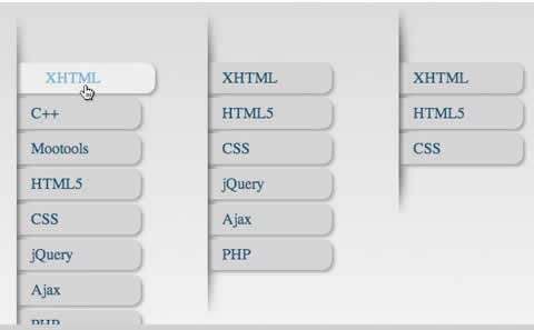
Here’s a quick experiment I did with CSS3. Again I was just mucking about with CSS3 transitions which could one day replace all the fancy jQuery animation tricks people use. The outcome was a really simple animated sliding verticle menu.
First off in the demo you might notice the gradient which is CSS too. Really easy to do that with this….
body { background: -webkit-gradient
(linear, left top, left bottom, from(#ccc), to(#fff));
}
Now we’ll style the un-order list with some padding and a background image to create a ridge like effect that our menu items will appear out of. The cool thing about this is by using -webkit-background-size’ the image is stretched if you add more items to it making the whole thing a bit more dynamic.
01 ul#nav {
02
03 list-style: none;
04
05 display: block;
06
07 width: 200px;
08
09 position: relative;
10
11 top: 100px;
12
13 left: 100px;
14
15 padding: 60px 0 60px 0;
16
17 background: url(shad2.png) no-repeat;
18
19 -webkit-background-size: 50% 100%;
20
21 }
Everything else is pretty bog standard really. A simple un-ordered list and that’s about it. The styling for the list item anchor tags is where it all happens. The addition of the ‘-webkit-transition:’ is going to allow us to animate to the ‘:hover’ state. 1 ul#nav li a {
-webkit-transition: all 0.3s ease-out;
}
It says ‘all’ animatable properties should animate over 300ms using ‘ease-out’, similar to jQuerys easing functions.
Next we’ll add the styling for the anchor tags with some fancy -webkit-border-radius and -webkit-box-shadow to give it some shape and depth and complete it with a backgroung image for each item to enhance our interface effect, making them look like their coming from underneath the ridge.
ul#nav li a {
-webkit-transition: all 0.3s ease-out;
background: #cbcbcb url(border.png) no-repeat;
color: #174867;
padding: 7px 15px 7px 15px;
-webkit-border-top-right-radius: 10px;
-webkit-border-bottom-right-radius: 10px;
width: 100px;
display: block;
text-decoration: none;
-webkit-box-shadow: 2px 2px 4px #888;
}
The properties we’re going to style are color, background-color and left-padding so let’s add them to the hover: state.
ul.nav li a:hover {
background: #ebebeb url(border.png) no-repeat;
color: #67a5cd;
padding: 7px 15px 7px 30px;
}
That’s about it really. No javascript and exactly the same effect. Probably be easy to make this degrade nicely for "certain” browsers. Now all you have to do is wait!
Автор: n/a
View Demo:
| 


